35 Presenting Correlated Data
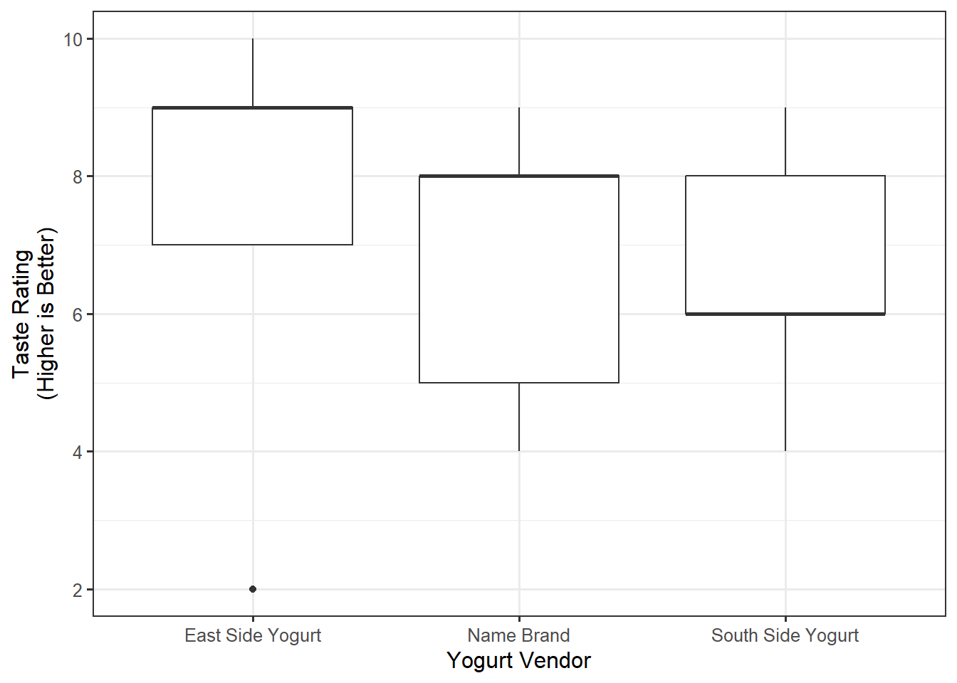
Consider the graphical summary in Figure 35.1 of the data from the Frozen Yogurt Case Study. While this graphic was praised for comparing a quantitative response across multiple groups, when a study makes use of blocking, such graphics are no longer appropriate. In particular, nothing in the graphic suggests correlation among some observations.

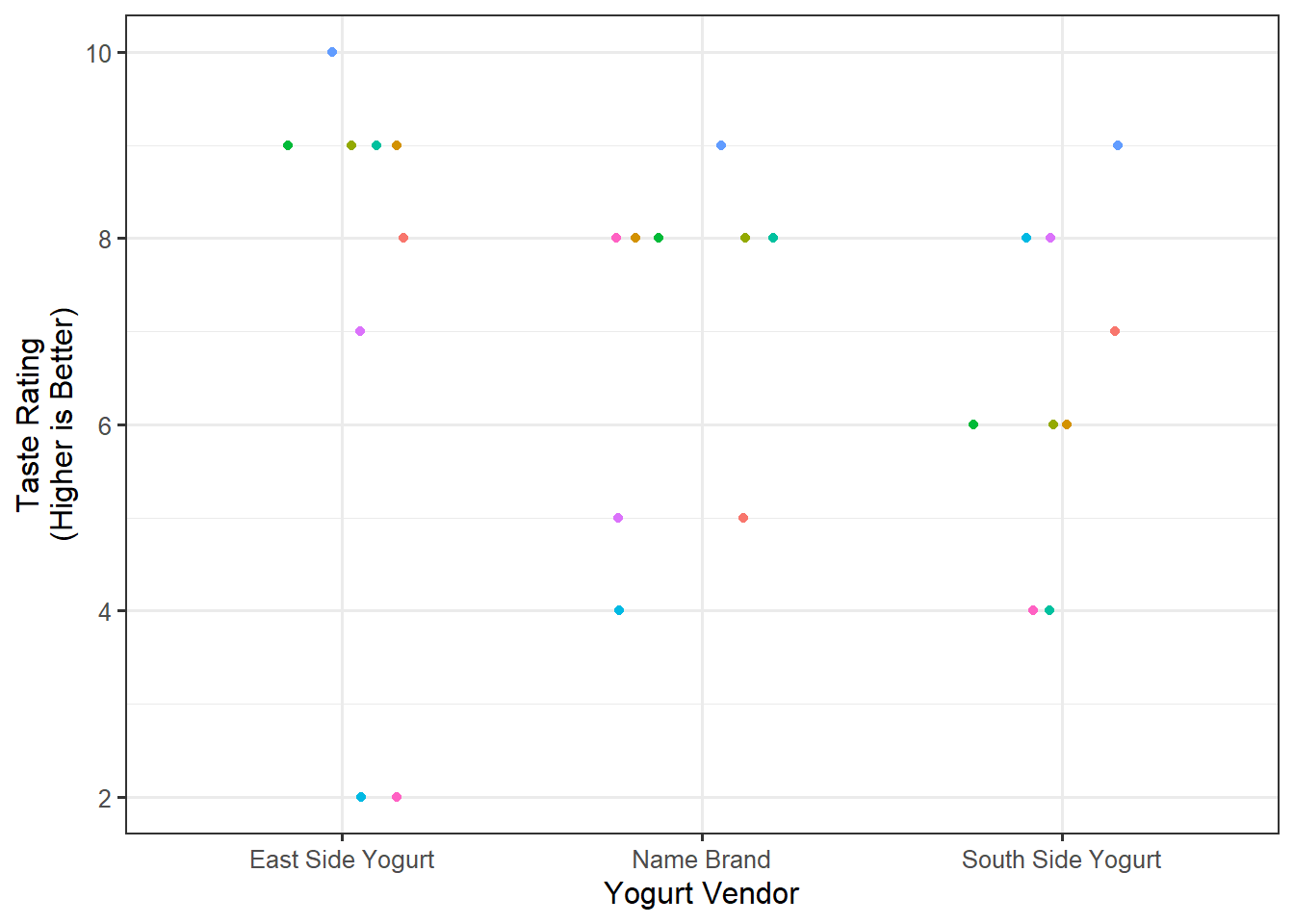
Summarizing correlated data can be quite difficult. If there are only a few blocks, indicating which observations correspond to the same block using some aesthetic (color, size, shape, etc.) can be helpful. For example, Figure 35.2 uses color to distinguish responses from the same participant. The color allows you to see that one participant (represented by a blue color) does indeed tend to rate all yogurts highly compared to other participants. The color draws out the correlation structure.

When color (or some other aesthetic) is used to denote observations from the same block, we often do not include a corresponding legend since the specific levels are not of interest. That is, which points correspond to Block 1 or Block 2 is not important; it is only important to know which points correspond to the same block.
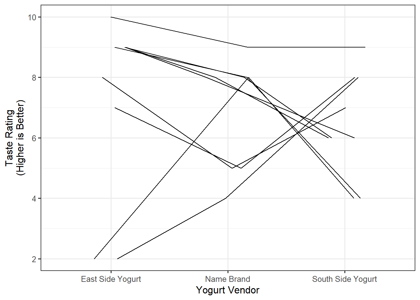
Even with only nine blocks, it can be difficult to distinguish one participant’s response from another in Figure 35.2. Another technique is to connect the responses from a single subject; this is illustrated in Figure 35.3. We note that within participants, there is not a universally preferred yogurt; however, most tended to prefer East Side to the Name Brand.

There is no universally adopted gold standard for summarizing correlated data. The key here is that the correlation in the data should not be ignored and should be illustrated in the summary while still addressing the primary question of interest.
We note that the correlation structure does not impact the average rating for each group. That is, we can still compute and report the average response within each group; however, the correlation structure is what helps us to properly visualize the variability when examining graphical summaries.
A good graphic should aid in partitioning the variability; with correlated responses, this includes indicating values that are related so that we can visually assess the variability between independent groups and within related groups.